
Waiting is typically an activity that is enormously unpleasant: unproductive, boring, and even tense.
And then, if you ask users to sit, there are those who would decline. According to a Research study, nearly half of consumers expect a site to be loaded in two seconds — and if it takes longer than three, leave 40%.
Device status visibility is one of the most significant principles
in UI / UX architecture. The intention behind this rule is quite obvious — to minimize user frustration within a fair period of time you can provide updates to the user about what is happening with the device. Don’t guess the users guessing-tell the user what’s happening. And one of the most common sources of such feedback is a measurement of success.
Here are some types of loading:
1. Page loading
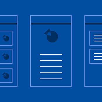
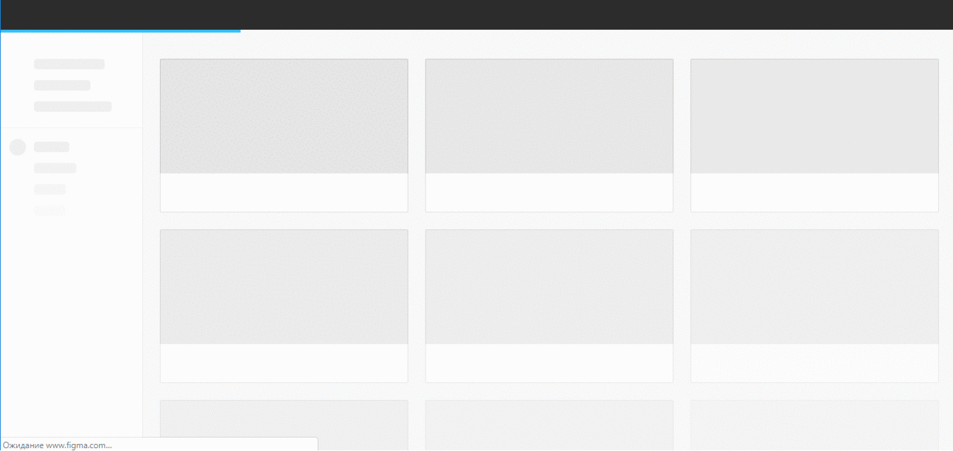
Skeleton screens
Skeleton screens provide incremental progress in loading the interface. You can imagine them as black pages (placeholders) with step-by-step loading of images, text and other content you might see on the page. This term firstly appeared in the Luke Wroblewski article, mentioned already (Mobile Design Details: Avoid The Spinner, 2013). Luke advised using skeleton screens for a better loading experience. This idea was supported by other designers in the space and used in the UI of Facebook, LinkedIn, YouTube, Google Drive & others. Some really cool findings on the topic you can read at Bill Chung guide.
Just to give a real example. If you use web design tool Figma, you saw a progress bar on the top of the page with gradual loading of UI — firstly you see placeholders for projects, then available data there:
Usage
Progress indicators remind users of the state of operational activities, such as launching a device, uploading a request, or saving updates. They describe an app’s condition and show possible activities, such as when users may move away from the current device Progress as a group When displaying progress for a sequence of processes, reflect the overall improvement of each activity rather than just the progress.
Principles
Informative
The progress indicators inform consumers that the last user activity takes longer for the device to process. The simplest form of process indicator is indeterminate — these types of indicators ask users to wait for something to finish but they do not indicate how long it will take.

Animated
Showing an animated loop graphic gives feedback that the system works, but usually does not give enough information about how long the user will have to wait.
Consistent
Progress indicators should be applied to all instances of a process (such as loading) in a consistent format (linear or circular).
2. Progress loading
Progress indicators express an unspecified wait time or display the length of a proces
a) Progress indicators
Linear and circular
Material Design offers two visually distinct types of indicators of progress: linear and circular progress. In an app, only one type should represent every activity. For example, if a refresh action displays a circular indicator on one screen, a linear indicator should not be used elsewhere in the app for that same action.
1. Linear indicator
2. Circular indicator
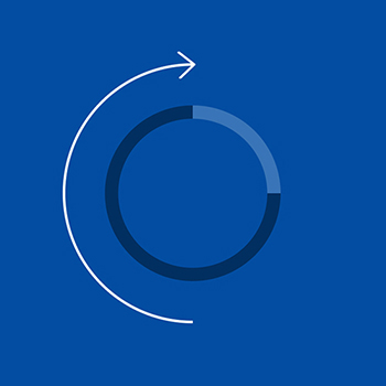
3. Circular progress indicators
Types
Circular progress indicators support both processes which are determined and indeterminate. Circular progress indicators support both processes which are determined and indeterminate.
- Determine circular indicators, when the tracker travels from 0 to 360 degrees, fill the translucent, circular track with color.
- When traveling around the unseen road, infinite circular indicators expand and shrink in scale.
Determinate and indeterminate
Progress indicators may be determinate or indeterminate:
| Determinate indicators | Indeterminate indicators |
| Determinate indicators show how long a process takes. Those can be used when measuring the completion rate of the operation. | Indeterminate metrics convey a fixed period of processing time. They will be used where change cannot be measured or where there is no need to say how long an operation should take. |
- Determine indicators of progress from 0 to 100%.
- The indeterminate indicators of progress move along a fixed track, growing and shrinking in size.
- When more knowledge becomes available about a phase, a progress indicator may transition from an indeterminate to a specified state.
A linear progress indicator changes from indeterminate to determine when a screen is loaded.
Solutions
Making the user experience robust is vital for creating and maintaining relevance in a highly competitive market. So, normally a sluggish UX triggers such problems: So, normally a sluggish UX triggers such problems:
Give Feedback Strategically
There are three-time limitations to be mindful of according to the Jakob Nielsen.
- If a response occurs within 0.1 seconds, it is perceived by users as “instant,” meaning you need not do anything but show them the result.
- If an answer happens within 1 second, the pause would be observed by users. Special feedback is still not necessary though.
- If a response takes more than 10 seconds, then you will lose attention of the user. Either distract them, or tell them how much longer it’ll take so they can start another task.

Credit: By Ketan (Dribble)
4. Linear progress indicators
Types
Linear indicators of progress support both defined and indeterminate operations.
- Determinate operations display the indicator growing in width from 0 to 100 percent of the line, correlated with the progress of the process.
- Indeterminate operations display the indicator growing and shrinking continuously along the track until the process is complete.
1.1 Linear progress indicators are composed of two required elements:
a) Track
The track is a fixed width rule, with set boundaries for the indicator to travel along.
b) Indicator
The indicator animates along the length of the track.
1.2 The More Updates, the Better
Credit: By OTAKOYI (Dribble)
1.3 Use Early Completion

Credit: By Josh Dunsterville (Dribble)
Credit: By MindTickle(Dribble)
1.4 Make It Fun
Credit: By Inbar Kofman (Dribble)
1.5 Integrate the Experience
By Alex Kunchevsky (Dribble)
5) Conclusion
This is the average person’s reaction time to a simple stimulus, like catching a falling pen or jerking away one’s hand from a hot cup. This is probably the most important time that we should remember.
The key recommendation is to use a looped indicator for 2–9 second delays, and a percent-done indicator for 10 second or more delays. But because you can’t often predict the delay exactly in advance, you may want to reduce the cutoff point between the two sources of improvement input so that the overwhelming majority of response-time delays that end up lasting longer than 10 seconds are alleviated by a percent-done sign. The greater the variability in your estimates, the lower the threshold for more elaborate feedback to show.
For a good user experience, giving input to users by utilizing reminders is important. Feedback will reduce user frustration and increase the amount of time they want to wait.
Thank you!
Follow Winjit: Linkedin | Instagram | Twitter | Facebook
Related Posts
 Trailblazing Transformation: The Epic Rise of the APAC IT Head – From Support Engineer to Visionary Leader
- How data science is changing the world!
- Wins of Winjit Women (Success Story #6)
- Wins of Winjit Women (Success Story #5)
- Wins of Winjit Women (Success Story #4)
- Wins of Winjit Women (Success Story #3)

