Apps, which make our life and work easy day by day, are the need of every individual these days. Slowly and gradually we are getting accustomed to these applications for the easy search of our requirements. Due to which app developers are competing even more to make one’s app easily and effectively recognizable in the marketplace such as iTunes, Google Play and Windows Store have transformed this into a digital battlefield for every competitor.
As apps are demanded by the users for their requirements, the marketing of these apps has to be appropriate in order to sell the specific app to the customer. To focus on this need, the strategy can be used such as App Store Optimization (ASO). This strategy consists of many elements and should be considered as the major component for the app to be published. It encompasses every detail of a mobile app’s page, and can be split into On-page and Off-page elements.
On-page app store optimization elements include all components that appear directly on an app page on the relevant app store. On-page elements are:
- App name and title
- App description
- App icon
- App screenshots and videos
- App category
Off-page app store optimization elements are external links that lead to the app page. They also encompass reviews by users, as they are not controlled by the publisher of the app. Off-page elements include:
- App rating, reviews and comments
- App recommendation pages
- Dedicated app landing page or website
- Press coverage
- Advertising
- Social paid and organic discovery options
Therefore, now, in this article, we’ll rapidly look at the importance of app screenshots, one of the two key decision-making elements, for the user who downloads an app.
Why is it essential ?
Now a days, the competition is at a peak for various applications around us. Every other individual is in search to get the better application for his/her usage. Due to every new application getting introduced into the market every day, the distractions of the user over these applications is highly observed. Hence, let us remember now that the very first impression for the user before buying an app will be dependent on the on-page elements. The design of an app represents the key factor for almost 50% of people to accept or reject an app. The app reviews and ratings are an important factor, but it should be taken into consideration that the on-page elements affect the impression of an app first.
As we all know, picture speaks louder than words, but in this case, we can definitely add to this as “Picture speaks louder with Words”. Hence, we can say that visual communication is highly effective as compared to the Verbal communication. So it should be considered that the app design should consist of appropriate taglines along with the suitable screenshots.
Importance of Aesthetics
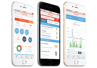
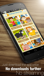
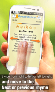
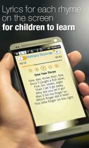
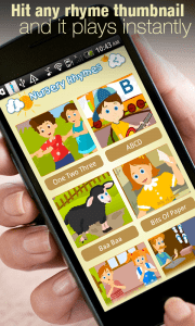
Over a certain period of time, now, a trend has been developed for the apps design not to be the plain screenshots but the shrunk ones along with the descriptive text over it. Hence, the screenshot should mention the picky or catchy tag line over it so that the buyer or user gets the quick idea for what the app is all about. In this fast age, everyone needs the clear understanding of any particular thing within few seconds or minutes. So, why not to provide buyer with the better and rapid view about our app?
The design of the app screenshots is highly dependent on the design of the app. This design has to be followed with the same fonts, colours and style you used to create your mobile app. Moreover, after designing of the apps, we can still improve the designs of the app screenshots to make it more attractive and appealing to the buyer. The role of the taglines and the colour combination along with the suitable font will be essential in the aesthetics of the app screenshots.
To be precise, the objective is to do something better than someone else, and find a way to describe this benefit in an effective visual demonstration.
How will it be relevant to the User?
The User, whenever tries to search for a needful app, the foremost thing seen by him/her will be the App Icon which resembles the app. Most commonly used screenshot is the “what your app does”. Now, for this purpose, the App Icon should be highly informative for what the app is mainly about. It has to be attractive with the proper colour combinations into it. The icon will eventually consist of the title of the app. Hence, the App Icon and the Title should go along well at the very first impression.
Secondly, once the user selects the app and opens it for its detail information, the screen with the screenshots is seen by the user. Now, this will be the major part of the app to be displayed. The screenshots if attractive, informative with the descriptive text in short, will attract the buyer to go ahead and know more about this app, for sure. Added to this, it should not be forgotten that the taglines over the screenshots should be clear and self-explanatory. Hence the screenshots as described above will play a major role in highlighting the core purpose of the app, adding to the better idea of it.
Last but not the least, the description of the app in brief will provide better idea to the buyer regarding the app in brief. Remember, this description should mention almost every particular detail about the content of the app. This will be the information provided to the buyer to decide whether the content of the app is satisfy their need or not.
Conclusion
The success of the app is not completely dependent only on the statistics or the aesthetics of the app, but also on the content and on many other factors. Technology is a highly dynamic field and requires constant updates in order to keep up with the ever evolving environment. Redesigning your app is a necessary step along the way. And, this article will help you in adding that special cherry to the cake in order to sell your app more easily and effectively. The app should be given a human attraction in terms of looks and visual cues and also give the app screenshots a good amount of focus. Thus it should be considered that
- Keep it simple and easily understandable.
- Make it fun! Use your creativity and good design skills to show the user what is so great about your app.
While creating your app screenshots you can pick one or two of the guidelines mentioned in this article and stick with them through all your screenshots; that way you would not overcrowd your designs.
To summarize, the most important takeaway lessons of this article are:
- Use all your available screenshot slots and put your most important screenshot first.
- Follow clear design guidelines and help your user understand your app from the first second.
Therefore, you can go ahead, and give your best in your apps to be more effective and highly informative at the very first look for the user. We wish you luck for the same!

